Citi added a new graph feature which summarizes your monthly spend by category. The Spend Summary works for current activity and activity up to six statements back. Pending transactions are not shown in the graph.
Here’s a look at my Premier card for the June statement. The annual fee comes up as Miscellaneous.

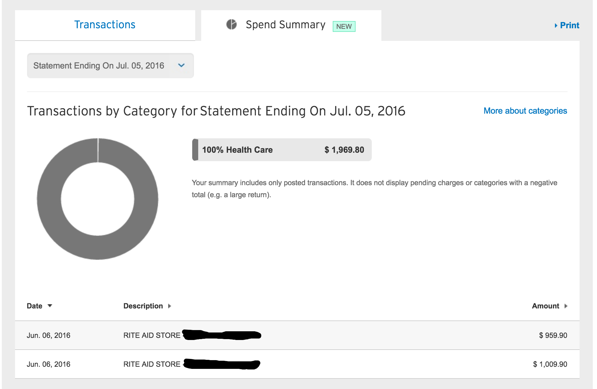
And here’s my Dividend card’s July statement:
All the detailed info is (and was) available by expanding the details of each individual transaction in the Transactions tab. Now we can also see each month as a whole in graph form.
It would be more useful if they’d enable year-to-date graphs or specific-date graphs, the same filters which are enabled in the Transaction tab. Unfortunately, they only graph out the current activity or one specific statement for the past six months.
[Note that only a few transactions show in the list under the Spend Summary tab, but the graph includes all transactions. You’ll have to tab back and forth between the Transactions tab and the Spend Summary tab to see the breakdown.]


You should have put all this effort into delineating WHICH charges are bonused on statement/website.
And by YOU I mean Citibank (they). Whoops.